
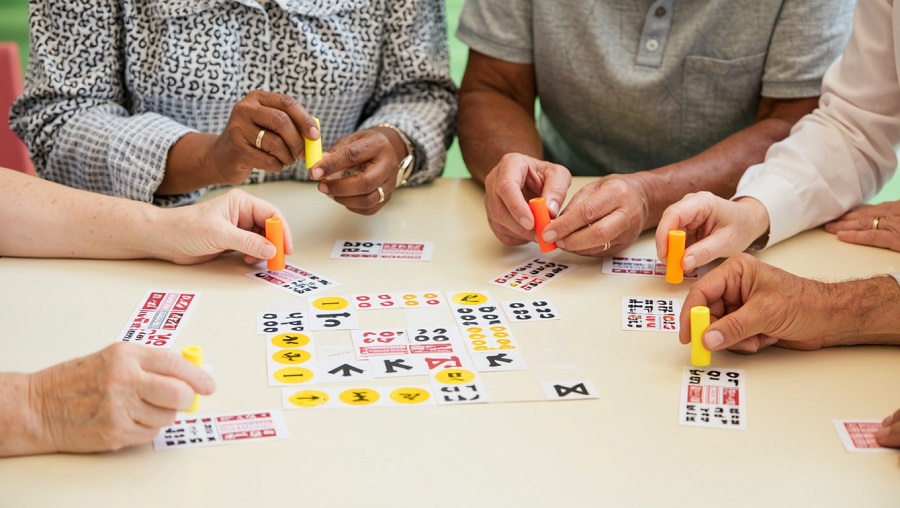
In a bustling bingo hall, speed and visual tracking dictate the entire pace of play. When a caller reels off numbers every few seconds, scanning across multiple cards requires rapid eye movements and immediate pattern recognition. For players managing age-related macular degeneration, glaucoma, cataracts, or diabetic retinopathy, that fast-moving environment can quickly turn from a fun night out into an exhausting exercise in eye strain.
While players often focus on sitting closer to the caller or buying larger cards, one of the most effective adaptations sits directly in the palm of your hand. The right bingo dauber does more than mark a square; it creates an immediate visual anchor on the page. Choosing an applicator formulated for high contrast and clean legibility restores confidence, reduces tracking fatigue, and ensures you never miss a winning call.
The Optical Paradox: Striking the Balance Between Contrast and Legibility
Selecting an effective dauber for low vision is not as simple as picking the darkest bottle on the shelf. In fact, reaching for deep navy, dark plum, or jet black is one of the most common mistakes visually impaired players make.
Dark, opaque inks certainly stand out against white or tinted newsprint, but they create a major functional problem: they completely obliterate the printed number beneath them. If you cover a digit with heavy pigment, verifying your card becomes a frustrating challenge. Hall workers need to inspect both the pattern and the underlying numbers to validate a win, and an opaque blot can lead to disputes or misread digits.
Conversely, light pastel inks present the opposite dilemma. Soft pinks, pale lavenders, and pastel yellows tend to dissolve under the harsh, humming fluorescent lighting typical of social halls and senior centers. From a distance of eighteen inches, a pastel mark on off-white paper can look nearly invisible to an eye with reduced contrast sensitivity.
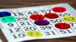
The ideal low-vision dauber solves this optical paradox through translucent vibrancy. The ink must produce an intense, saturated circle that registers instantly in your peripheral vision while allowing the black printed number beneath it to remain crisp and distinct.
Essential Features to Prioritize for Visual Impairments
Not all daubers are manufactured to the same standard. When visual acuity is compromised, specific physical and chemical details separate an ordinary marker from an accessible tool.
Pigment Chemistry and Light Reflection
Fluorescent and optical pigments are exceptionally valuable for low vision because of how they interact with ambient light. High-grade fluorescent inks do not just reflect room lighting; they absorb invisible ultraviolet waves and re-emit them as visible light within the color spectrum. This optical property creates a subtle glowing effect on the paper, creating an unmistakable boundary around the marked square even in dim or unevenly lit rooms.
Controlled Flow and Bleed Resistance
Bingo paper is famously thin and absorbent. Low-grade liquid daubers often release too much fluid at once, creating wet puddles that bleed through to the cards underneath in multi-sheet booklets. For a player with low vision, a bled-through ink stain on sheet three looks identical to a marked number, causing false alarms and severe confusion later in the session. Quality daubers feature spring-loaded or controlled sponge valves that deliver a uniform, quick-drying layer with minimal strike-through.
Ergonomic Grip and Mechanical Stability
Low vision frequently coexists with reduced hand strength, arthritis, or minor tremors. If a bottle is slippery or requires excessive downward pressure to release ink, your precision suffers. Look for daubers featuring grooved hourglass barrels, rubberized non-slip sleeves, or wide ball-shaped tops. These ergonomic designs stabilize the hand, making it much easier to align the tip over the target square without leaning down to table level.
Top High-Contrast Ink Profiles and Applicator Styles
Evaluating individual products comes down to color science and tip mechanics. These specific categories consistently offer the highest functional returns for low-vision players.
Radiant Fluorescent Magenta and Hot Pink
Fluorescent pink and magenta formulations represent the undisputed gold standard for low-vision play. Red-violet shades sit opposite green and yellow on the visual color spectrum, offering peak contrast against the grayish-beige cast of budget newsprint. Crucially, magenta dye bases are naturally luminous without being muddy, allowing the crisp black font of the number to show through cleanly while providing an unmistakable pop on the grid.
Brilliant Optic Orange
Tangerine and safety-orange tones are among the easiest wavelengths for the human eye to detect under fluorescent tubes. Because orange contains high yellow reflectance without losing chromatic saturation, it frames numbers with sharp perimeter definition. It is particularly effective for players dealing with central vision loss who must rely heavily on their peripheral awareness to monitor secondary cards.
Deep Translucent Jewel Tones
If you prefer cooler tones over neon shades, seek out jewel-tone formulations like royal blue or vibrant emerald that specifically advertise a transparent dye base. These shades provide substantial color depth that punches off the card, but because they lack chalky opaque binders, the typography remains completely legible.
Hollow-Core or Ring-Tip Daubers
For players who consistently struggle with obscured numbers, ring-tip daubers offer an ingenious mechanical workaround. Rather than a flat, solid sponge, the applicator tip features a raised circular ring with a recessed center. When pressed against the card, it leaves an intense colored circle around the number, framing the digit like a bullseye while leaving the number itself completely untouched.
Environmental Adjustments for Maximum Contrast
Even the best dauber performance depends partly on your playing environment. To get the clearest view of your cards, integrate your choice of ink with your broader setup:
-
Complement the Card Color: Bingo booklets rotate through different border and background tints throughout the session. Using a blue dauber on a blue-tinted card destroys contrast. Keep two complementary colors in your kit—such as a neon magenta and a vivid orange—so you can switch shades when the paper color changes.
-
Upgrade to Large-Print Paper: Pair high-contrast ink with large-print sheets, commonly sold as EZ Reader or Sight Saver cards. The expanded grid squares provide ample room for wide sponge tips without clipping adjacent numbers.
-
Manage Overhead Glare: Position your cards to avoid direct glare from bare overhead bulbs. Glare reflects off wet ink and glossy table laminates, washing out contrast before the ink dries.
Equipping your game bag with daubers engineered for optical clarity removes an unnecessary layer of strain from the evening. By pairing luminous pigments with stable, comfortable grips, you can stop squinting at ambiguous marks and focus entirely on the excitement of the next number called.